A New Brand Identity for Gladys Assistant

Hi everyone!
When I arrived in Bali 2 months ago, I went with a simple goal: spend more time on Gladys to bring the project to another level.
Since the beginning of the project, I didn't take the time (and didn't have the money) to hire a professional designer to work on Gladys brand identity. I wanted to change that when arriving here in Bali.
Luckily, two days after arriving in Canggu, I met a designer at Dojo Bali barbecue: Oliver Swinburne.
Oliver is a designer and illustrator from London, who works remotely like me. You can see his work on Dribbble or on his website oliverswinburne.com .
I immediately told him about my needs, and we planned to have lunch the following week.
Designing the logo
I explained to Oliver what Gladys does, what's the story behind the project, and what's my vision for the next years.
Two weeks later, Oliver came back with a 19 pages PDF. This PDF was a summary of his research and was exploring 3 logo possibilities.
![]()
Each route was followed by a description of his work. Here are a few examples:
Route 2a: Looking at the idea that Gladys is always learning and is evolving, this route variation uses round natural shapes representing a central system or eye of Gladys with her adaptive learning exposed underneath.
Route 2b: Logo design Keeping a circular shape, this represents a more digital representation while making an effective use of gradient color to highlight Gladys and her learning and always adapting nature.
Finally, after a few messages, we ended up with this brand new logo for Gladys:
![]()
With the following colors:
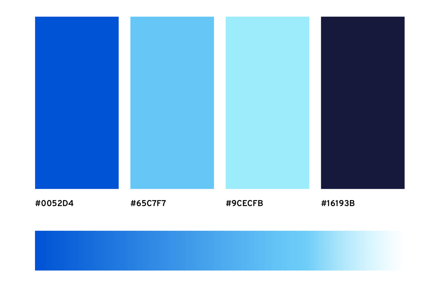
And the main font, Overpass.
I just love it 😍
A new homepage
Designing the logo was just the first step. We needed a proper new homepage, and for that Oliver proposed to design an illustration that we could fit not just on the homepage, but on the social networks banners as well.
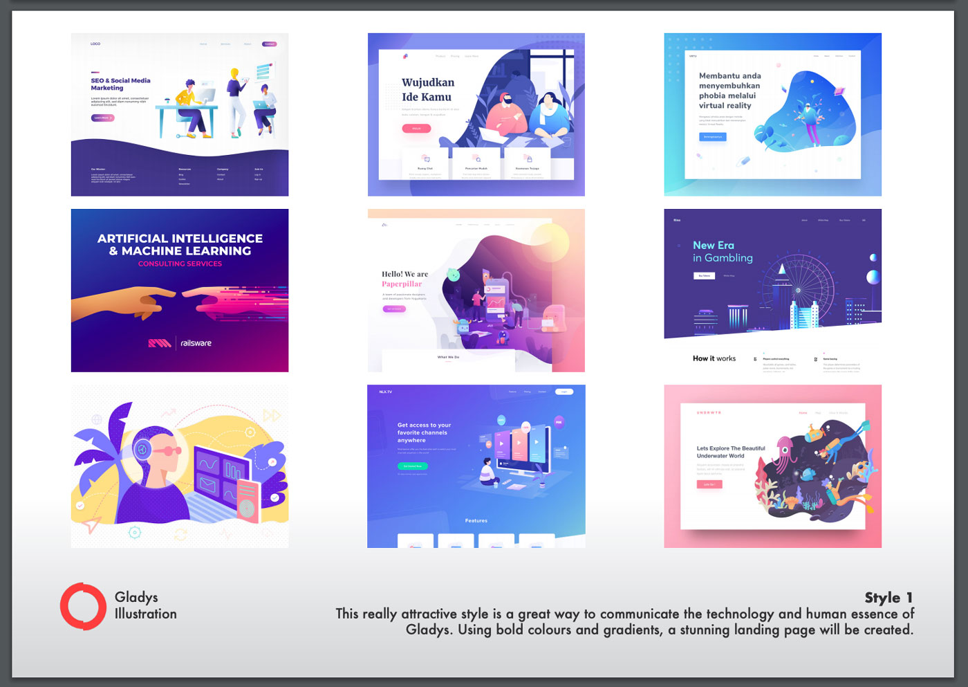
He first asked me what style I wanted between:
- Flat style with bold colors and gradients
- Isometric style with bold colors and gradients
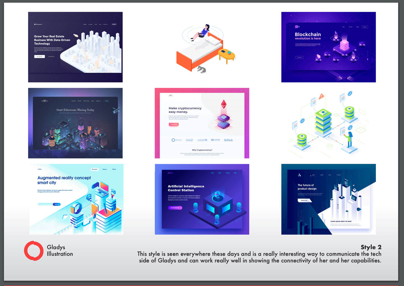
I was more into Proposition 2, that shows better all the tech behind Gladys.
So Oliver began this first draw on paper:
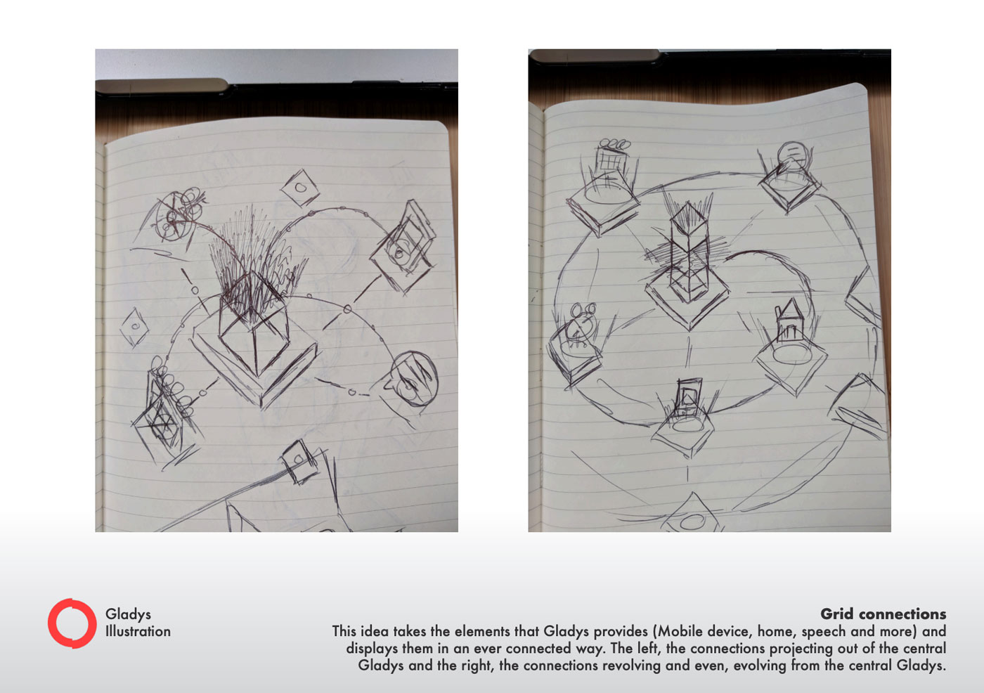
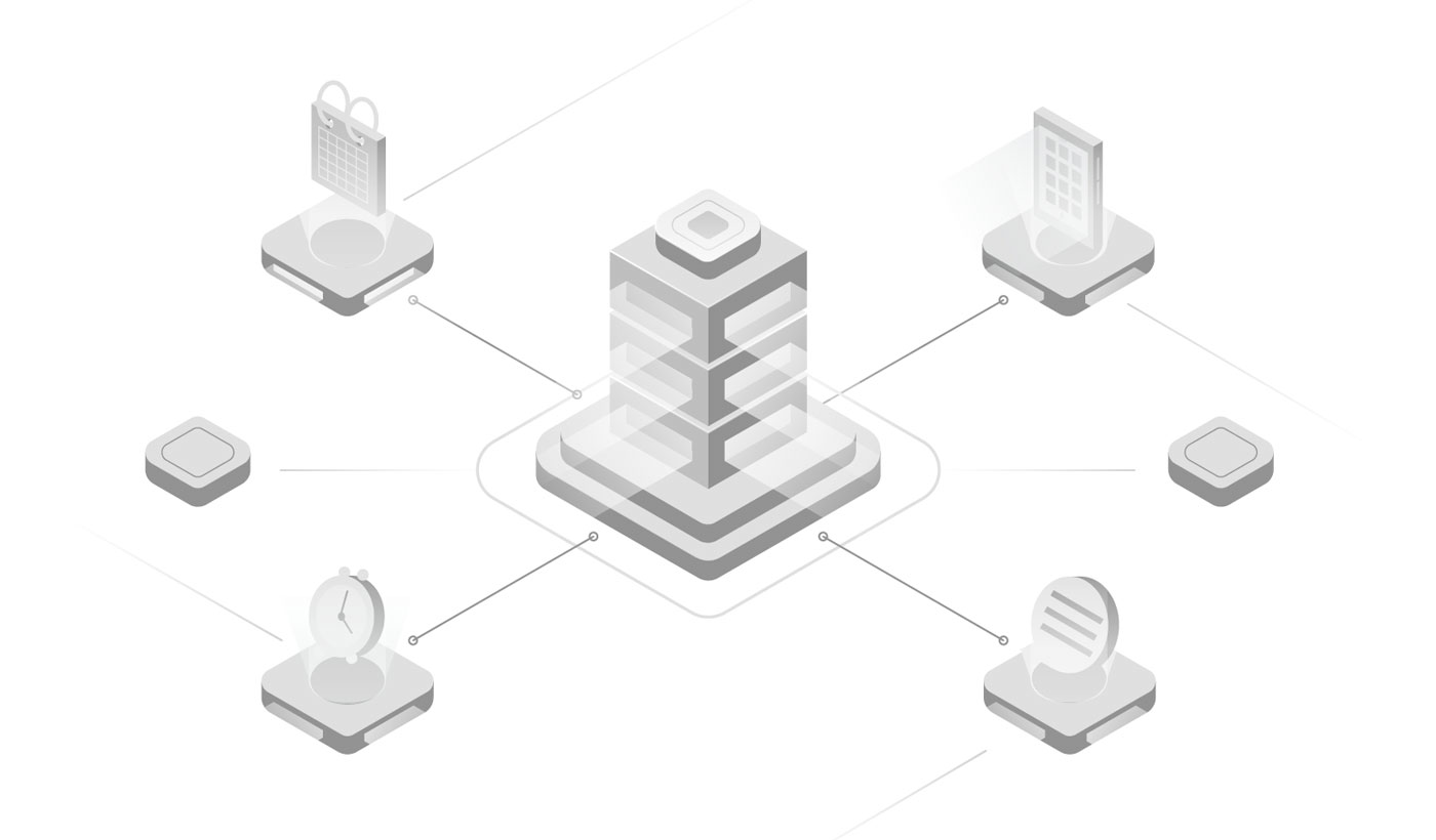
Then, he proposed this first version in black and white:
And finally, designed this homepage:
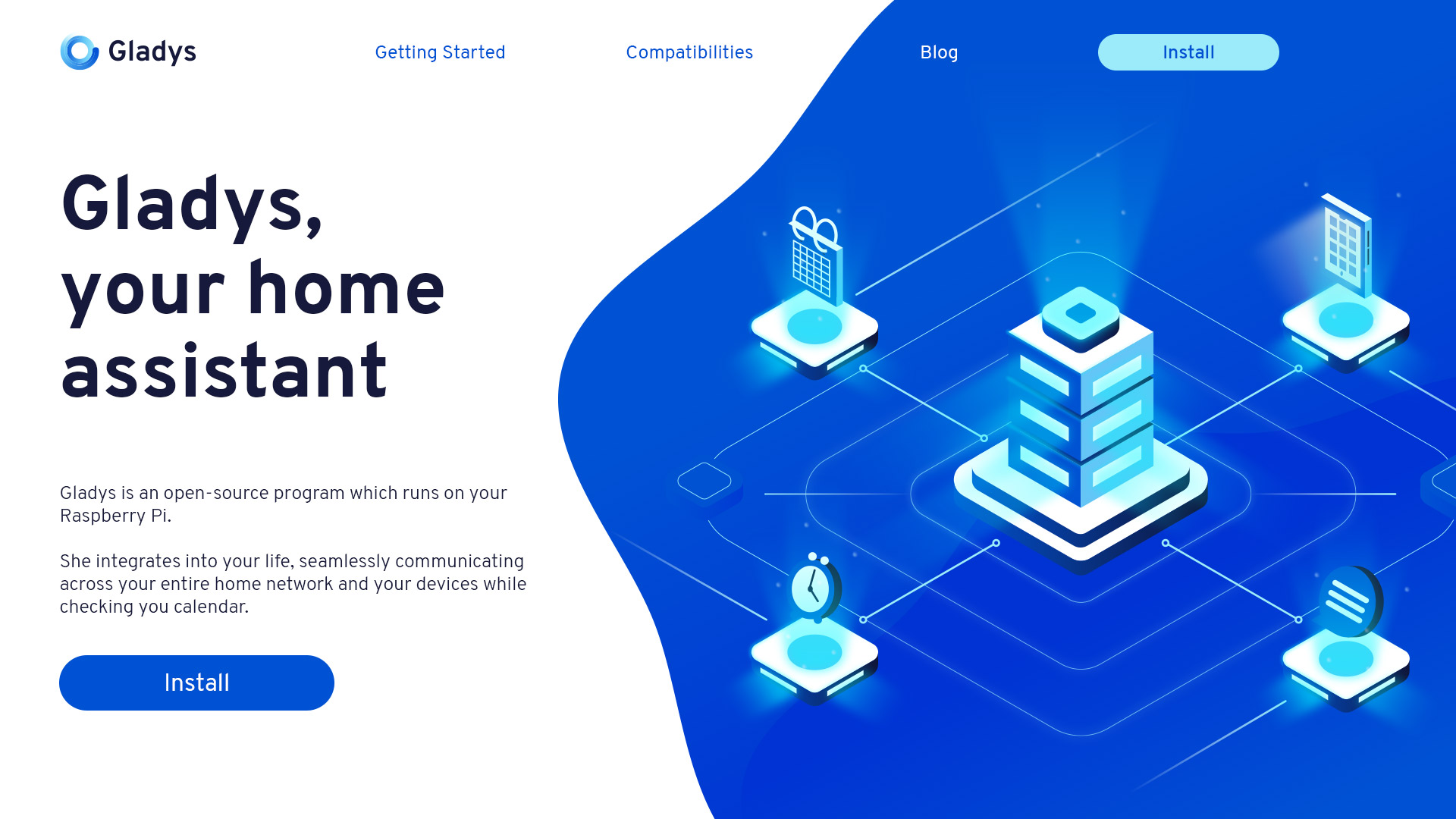
My reaction was: WOOOOOOOOOOW 😱
The design looks just amazing and perfectly describes what Gladys does: An assistant, connected to your devices, and your online services.
It's live 🚀
From the idea, the discussions, the work on Oliver side, then the work on my side to adapt everything, it took us almost 1.5 months to get all that ready. I was not talking about it on social networks to keep the surprise for you, but it's now live!
Don't hesitate to share the news, I'm really happy this is finally out 🎉
See you on Gladys,
Pierre-Gilles