Virtual buttons Smart-Home-Integration, kostenlos und Open Source
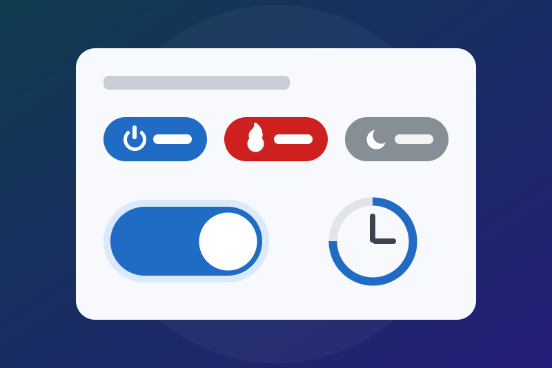
Your own buttons, switches, timed switches and selectors, with an icon, for your scenes.
Veröffentlicht von LM1LC3N7
- Geräte
- Version 0.1.8
- Erfordert Gladys >=5.1.0
- ★ 0
Die Dokumentation dieser Integration wird von ihrem Autor geschrieben und ist bisher nur auf Englisch verfügbar.
Create your own buttons in Gladys, with a name, an icon and a colour, then start a scene when you press them. No need to fake an MQTT device.
Unofficial integration. Tested with a fake Gladys only (the automatic tests of the project), never yet on a real installation.
The four types of button
| Type | What it does | Example |
|---|---|---|
| Push button | One press = one pulse: it goes to 1, then back to 0 by itself one second later. | "Start movie" |
| Switch | On / off, remembered (even after a restart). | "Night mode" |
| Timed switch | On, then back to off by itself after the chosen duration (1 to 1440 minutes). Pressing "on" again starts the duration over. | "Heating 30 min" |
| Selector | 2 to 6 named positions, one at a time, remembered; each position can start its own scene. | "Heating mode" |
A button controls nothing by itself: a scene acts when it changes. The button is the remote, the scene does the work.
Step 1: create the button
- In Gladys, open Integrations, then Virtual buttons, tab Configuration.
- Click Add a button. A small form opens:
- Name: for example
Heating(up to 40 characters; the widget shows 24); - Type of button: tick one of the four lines, each explained in one sentence. The type cannot be changed later;
- Duration in minutes: for the timed switch only;
- Positions: for the selector only, 2 to 6 names separated by commas,
in order, 20 characters each at most; for example
Comfort, Eco, Frost protection, Off, or the 6 orders of a pilot wireComfort, Comfort -1, Comfort -2, Eco, Frost protection, Off. At creation, the selector is on the first one; - Icon: a list of 50 icons, each with a plain name, grouped by theme: on / off, switch, play, pause, stop, flame / heating, radiator, cold / frost protection, light bulb, shutter, plug, music, house, door, bed / bedtime, meal / kitchen, party… To see them before choosing, add the Icons widget (see below);
- Colour of the button (widget): main (blue), secondary (grey) or danger (red). It is the colour of the pill;
- State light when on (switch, selector) and State light when off (switch): the colour of the light of a switch or a timed switch in the widget: green, blue, light blue, orange, red or grey. By default: green when on, grey when off. A selector's light takes the "when on" colour (it is always on one of its positions). Light blue and orange are the palest on the light theme: prefer green, blue, red or grey. The light is a row above the pills. The pill follows these colours too when Gladys has them for a pill: blue (or light blue, shown blue) and red when on, blue, red and grey when off. Green and orange do not exist for a pill: when on, it then takes the colour of the button; when off, grey. An off pill never looks like the on pill (grey then). Example: red when on, blue when off gives a red pill when on, a blue one when off. No effect on a push button, nor "when off" on a selector ("Change a button" ignores them there);
- Ask for confirmation before pressing (widget): yes or no.
- Name: for example
- Confirm. Under the button, the message says:
Button "Heating" added. Now open the Discovery tab….
Step 2: add it to Gladys (Discovery tab)
Gladys does not let an integration create a device on its own: you approve it.
- Open the Discovery tab of the integration. What you see: one card per button. At the top, the name of the button as the title; below, "Features" with a tag ("Push button" for a push button, "Switch (On/Off)" for a switch or a timed switch, "Selection" for a selector); then a folding link "Technical parameters": that is the look of the button (icon, colour…), do not change it; at the very bottom, a green "Add to Gladys" button.
- Click the green "Add to Gladys" button. The header of the card then shows the badge "Already added".
- The button appears in the Devices tab, with the same tag "Push button", "Switch (On/Off)" or "Selection".
Step 3: the scene that acts
Open Scenes, click New scene, give it a name and an icon (the flame, for example), then add a "Device state change" trigger and pick your button in the device list. What comes next depends on the type.
For a push button
What you see under the chosen device: a list of button events, and a toggle "Run the scene after the condition has been valid for:".
- Choose "Simple click". There is no value to type: the scene starts at every press.
- Leave the toggle "Run the scene after the condition has been valid for:" off.
- Action: for example "Set device value", choose the plug of the heater and switch its toggle on (on = turn on).
- Save and enable the scene.
For a switch or a timed switch
What you see under the chosen device: two buttons "On" and "Off", then three toggles, in this order:
- "Start the scene on any state change, whatever the value": leave it off (on, it hides "On" and "Off");
- "Execute only when threshold is passed (and not at every value sent by the device)": switch it on;
- "Run the scene after the condition has been valid for:": leave it off.
- Click "On".
- Set the three toggles as above: only the second one is on. The scene then starts only when the switch goes from off to on, never twice in a row (nor at a restart).
- Action: for example "Set device value", choose the plug of the heater and switch its toggle on.
- Make a second, identical scene with "Off" (same toggles) whose action switches the toggle of the plug off. For a timed switch, this "Off" scene also starts when the duration ends.
For a selector
What you see under the chosen device: a list of operators, a list of the positions of your selector (by their names), then the same toggles as for a switch.
- Choose the operator "equal", then the position in the list (for example "Eco"). If a text field shows instead of the list, click "Choose from the list of values".
- Set the toggles as for a switch: only "Execute only when threshold is passed" is on.
- Action: for example "Set device value" on your radiator or pilot wire, with the mode you want.
- Make one scene per position (4 positions = 4 scenes). A position keeps its number even when you rename it: your scenes keep working.
Loops
Do not make a scene that sends a command back to the button that started it. The integration protects itself:
- a press, an "on" or a change of position repeated more than 20 times in a minute on the same button by Gladys (a scene, the "Devices" box, the voice) is refused for the rest of the minute. Taps on the widget card are not counted: Gladys itself limits them to 30 a minute;
- the "off" of a switch is never refused; an "off" of a switch already off (and an "on" of a switch already on, or the position a selector is already on) is accepted without sending anything to Gladys, so without starting a scene again.
Step 4: the "Buttons" widget on the dashboard
- Open your dashboard, switch to edit mode, add a box and choose the Buttons widget (of the Virtual buttons integration).
- In its settings, choose 1 to 4 buttons (Button 1 to Button 4). No slot is mandatory: you can fill Button 2 and leave Button 1 empty, and the widget shows the chosen buttons in the order of the slots. With none chosen, it says "Pick at least one button in the settings of this widget". Only the buttons added to Gladys at step 2 are listed.
- The widget shows one pill per button, with the chosen icon, name and
colour:
- pressing a push button sends a pulse; the message says "pressed", or the error if Gladys did not take it;
- above the pills, each switch (timed or not) has a state light row: its icon in the chosen colour, its name, and its state in words, "On" or "Off". By default the light is green when on and grey when off. You can choose both colours for each switch (green and red, for example);
- the pill of a switch that is on is filled, with a tick in place of its icon: red or blue if its light when on is, otherwise in the colour of the button (blue if you chose grey). Off, it has its icon, in blue, red or grey if its light when off is (and the on pill does not already look like that), otherwise grey. A press does what the pill shows: turn off a pill that is on, turn on a pill that is off (if the state changed meanwhile, the message says "already off" or "already on");
- for a timed switch that is on, its state light also gives the time left ("On · 25 min"). Its pill follows the same rules as a switch's. For another look, change the colour of the button or those of its light with "Change a button";
- a selector takes one pill per position. The current position stands out: a tick and the colour of "State light when on" if it is blue or red (otherwise the button's), the others grey. Its light, above, names it ("Eco", or "Position: 4" for a number) in the colour chosen for "State light when on". A press puts the selector on the position of the pill (the message says "already on Eco" when it was). A card holds 4 pills at most: a selector of 4 positions takes a card of its own. A selector that has no room left for all its positions shows none (never half of them): a message says to show it on another card;
- a selector of 5 or 6 positions takes a single pill, with its icon, its name and its current position ("Heating: Eco"). A press opens a list of its positions, the current one already chosen: pick one and confirm. This list needs a recent Gladys (the version where a widget button can open a small form); with an older one the press does nothing and the message asks to update Gladys. The "Devices" box works with every version;
- if you asked for a confirmation, Gladys asks you to confirm before sending.
- For more than 4 buttons, add several widgets. Gladys accepts at most 30 presses a minute on the widgets of the integration, all widgets together, and after each press reads every open "Buttons" card again (30 reads a minute for the whole integration, every screen included). Beyond that, Gladys itself refuses: "The action failed", and the cards stay frozen for up to a minute before coming back. With two cards open, that leaves about fifteen presses a minute: if you press often, group your buttons on few cards. Within these limits, fast presses are all taken, the last one wins, and a press never holds the other buttons.
The buttons also work in the usual Gladys boxes: the "Devices" box of a room (a "Push" button for a push button, a toggle for the switches, a group of buttons for the positions of a selector, or a drop-down list when they do not fit), and for the switches the "Quick actions" box. There, the icon is the Gladys one: the icon you chose only shows in the "Buttons" widget. The confirmation only exists in the widget: the "Devices" box, a scene, the voice or an assistant press without asking.
See the icons before choosing: the "Icons" widget
The forms can only show text: the "Icon" list gives each icon a name, not its drawing. In Gladys, a choice of an integration form (drop-down list or radio buttons) holds a value and a name, nothing else: no room for a picture. The mode screens with icons (thermostat, air conditioning…) are drawn by Gladys itself for its own devices, and an integration cannot use them for its forms. To see the drawings:
- On a dashboard, in edit mode, add a box and choose the Icons widget (of the Virtual buttons integration).
- In its Page setting, choose a page (1 to 5): each one shows 10 icons, in the order of the "Icon" list of the forms, with the drawing, the name shown in the form and the technical name.
- Once you have chosen, you can remove this widget.
Change or remove a button
- Change a button: pick the button in the list (or type its name if it is not added to Gladys yet). The other fields say "Unchanged" (duration: 0); change only what you want. The result message lists what changed ("icon: Flame / heating; colour: unchanged…"). The type does not change. A new duration applies at the next "on". A new name does not rename the Gladys device: rename it in the Devices tab too if you wish. For a selector, the field New positions replaces the list (empty: unchanged). A position keeps its number: rename it in place, add or remove at the end (moving or inserting a position in the middle is refused: it would change the numbers your scenes use). The current position cannot be removed: put the selector on another position first. Gladys gets the new names with the next Discovery publication (right after). The form keeps its values after a run: reload the page before changing another button. If you apply exactly the same changes to another button right after, the integration asks you to run the action again to confirm.
- Remove a button: it is final (the scenes that used it will not find it again). Pick the button in the list (that choice is the confirmation), or type its name if it is not added to Gladys yet. If you fill both, they must name the same button, otherwise nothing is removed. A switch that is on is turned off first: its "Off" scenes run. Then delete its device in the Devices tab if you had added it to Gladys, and edit the dashboard cards that showed it (Gladys shows a settings error there otherwise). If you only delete the device in Gladys, the button stays listed in Discovery.
Safety: read this before controlling anything important
- A virtual switch can be turned off (or on) by others than you: a "turn everything off" command, the voice or the chat ("turn off Heating"), a connected assistant, any scene, any dashboard (even a wall screen). For a sensitive command (gate, alarm, boiler, garage door), never use a switch: use a push button with confirmation in the widget, put the conditions in the scene (someone at home, time of day, alarm state…), and do not show this button in the "Devices" box of a public dashboard (it presses without confirmation).
- The state of the button is not the real state of the device it controls. "Heating: on" means you pressed, not that the boiler is heating. If the scene fails or the device does not answer, the button does not know. To see the real state, add a real sensor (a plug that measures power, a thermometer) on your dashboard.
- The buttons are never declared as lights, so a "turn off the lights" never reaches them. A selector is neither a switch nor a Gladys heating mode (it is a "Selection"): a "turn everything off" or a "set every radiator to eco" does not change it. For heating modes, the scene acts, with its conditions; the selector only says what you chose.
- An "on", a press or a change of position that arrives too late (Gladys has already shown a failure, after 5 seconds) is refused: nothing is sent. The "off" of a switch is always applied. A selector has no "off": all its positions are handled like an "on" (even a position named "Off").
- If the container of the integration is stopped, a press fails (Gladys shows it). A timed switch whose duration ended while it was stopped goes back to off as soon as it starts again. A restart or a reconnection never sends Gladys a value it already holds: your scenes do not start again.
The alternative without this integration: a scene in "Quick actions"
If all you need is a button that starts a scene, Gladys already does it, without this integration and without a container:
- Create the scene (for example "Heating 30 min") and pick its icon in the icon picker of the scene (the flame, for example).
- On the dashboard, add the "Quick actions" box (or the Scene box), then add the scene with the label you like.
- A press starts the scene, with its icon.
This integration is mostly useful when you need a state: an on/off switch that is remembered, or a switch that goes back to off by itself after a duration.
Limits
- 100 buttons at most, 4 per widget (add several widgets); a selector has 6 positions at most. Up to 4, each one is a pill of the widget; with 5 or 6, the widget shows one pill that opens the list (a card holds 4 pills at most).
- No long press nor double press, no free colour nor button size. A pill has only three colours: blue, grey and red. No green nor orange pill: Gladys keeps green for buttons tied directly to a device, which can neither ask for a confirmation nor toggle on/off with the same press. The pill follows the colours of the light when they are among these three. Green exists for the state light of a switch, which has six colours: green, blue, light blue, orange, red and grey. These are the colours Gladys gives to widgets; no free colour code (#00ff00).
- The shape of the buttons is the Gladys one: a pill with an icon and a name. An external integration draws nothing itself (no HTML nor CSS: Gladys renders the widgets from a list of components fixed by the core). So there is no round on / off button; the closest: a switch with the "On / off" (or "Switch") icon, with a green light when on and a red one when off if you want its state to stand out. No pull cord (slider) either: the "Devices" box of Gladys only shows a slider for real functions (light, volume, shutter, fan, duration, charge limit…), never for a plain number, and the widgets of an integration have no slider at all. Using one of those functions would make the button pass for a real device (a "turn off the lights" would reach it): this module never does. Nor a rotary knob: Gladys only has a round dial in its thermostat box, for real thermostats. What exists is the list: the "Devices" box shows the positions of a selector as a drop-down list when they do not fit on one line (Gladys decides, depending on the width of the box), and the widget shows a list for a selector of 5 or 6 positions.
- No icon of your own on a button, a status line or a tile (ICO, PNG, SVG file): Gladys only shows the icons of its own set there, by their name (the widgets do have an image component, but it is a picture, not an icon). If an icon is missing from the list, ask for it on the GitHub repository: it can be added if Gladys has it.
- The integration does not start scenes itself: the state change of the button starts them (step 3).
- The widget updates at every press on the card, within 11 seconds of a change made elsewhere (a scene, the "Devices" box, the end of a timer), and otherwise every minute.
- If the saved list is lost (a new volume), the buttons are rebuilt from the Gladys devices: a switch and a selector take back the value Gladys holds, a timed switch comes back off (its "Off" scene runs).
- Tested with a fake Gladys only: please report what does not work on the GitHub repository.
Data
The list of the buttons, their state, the positions of a selector and the end
of a timed switch are kept in
/data/virtual-buttons.json, the volume of the integration. Nothing leaves your
Gladys. If this file cannot be read, the integration never overwrites it and
says so in its status.
Konfigurationseinstellungen
Diese Einstellungen fragt Virtual buttons in seinem Konfigurationsbildschirm in Gladys ab.
| Einstellung | Typ | Pflichtfeld | Beschreibung |
|---|---|---|---|
| Create your own buttons | section | Nein | 1. Click "Add a button" below: a name, a type, an icon. 2. Open the Discovery tab and click the green "Add to Gladys" button at the bottom of its card. 3. Create a scene with the trigger "Device state change": for a push button choose "Simple click"; for a switch choose "On" (a selector: "equal" and the position) and switch on only the toggle "Execute only when threshold is passed". 4. Add the "Buttons" widget on your dashboard. The button does nothing by itself: the scene acts. Never use a switch for a sensitive command (gate, alarm, boiler): a "turn everything off", the voice or a scene can reach it; use a push button with confirmation. Tested with a fake Gladys only. |
So installierst du Virtual buttons in Gladys
- Öffne in Gladys Integrationen: Virtual buttons erscheint im Katalog neben den nativen Integrationen, mit einem Community-Badge.
- Klicke auf Installieren. Gladys lädt das Docker-Image (
ghcr.io/lm1lc3n7/gladys-virtual-buttons:0.1.8) herunter, startet es in einer vom Kern isolierten Sandbox und erzeugt die Oberfläche der Integration (Geräte, Erkennung und Konfiguration). - Öffne den Bildschirm Konfiguration der Integration, fülle die Einstellungen aus und speichere.
- Du kannst sie auch direkt über die URL ihres Repositorys installieren: https://github.com/LM1LC3N7/gladys-virtual-buttons.
Virtual buttons benötigt Gladys >=5.1.0. Der Katalog in Gladys wird stündlich aktualisiert, eine neue Version ist also spätestens eine Stunde nach ihrer Veröffentlichung verfügbar.
Du nutzt Gladys noch nicht? Es ist kostenlos und Open Source: folge der Installationsanleitung, um loszulegen.
Über externe Integrationen
Virtual buttons ist eine externe Integration: eine Community-Integration, die als Docker-Container verpackt und auf GitHub veröffentlicht wird. Gladys installiert sie mit einem Klick und führt sie in einer vom Kern isolierten Sandbox aus. Sie wird von LM1LC3N7 veröffentlicht und gepflegt, nicht vom Gladys-Kernteam.
- Alle Integrationen durchsuchen, native und aus der Community
- Deine eigene externe Integration bauen und veröffentlichen
- Quellcode auf GitHub — Quelle dieser Dokumentation